Poster Analysis
Annabelle
|
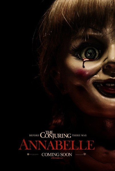
In Annabelle's poster, the main focus is on the doll 'Annabelle'. Although the poster is quite plain it does stand out and follows the horrors codes and conventions meaning it does still come off very effective. The colours used on this poster are quite dark and dull, which connotes the idea of death. The slight shadows of red within the poster demonstrates danger and pain which would give a hint to the audience of what will be featured in the film.
The foreground image consists of the scary doll Annabelle, this is the main focus as the children's doll takes up the whole right hand side, which makes the audience instantly focus on the doll. This follows the typical horror poster codes and conventions as it is an item which is known for horror and how the doll represents a scary childhood toy. The dolls colour is pretty neutral, so it doesn't stand out too much against the black background. The dark background adds mystery as it makes you think what could potentially be lurking in the darkness- the unknown adds tension. The poster mainly being covered with a doll makes it clear that the doll plays a huge part to this movie. The doll has a tear of blood leaving its eye, showing that it is not the average children's doll and the doll has a lot of anger and pain showing it to be quite dark and disturbing. The tagline include the name of the movie 'The Conjuring', showing that Annabelle is a prequel of the successful movie, slyly advertising it even more. Below the title 'Annabelle', it says 'Coming soon' which informs the audience that the film is going to be released soon but there is not an exact date dated, it would raise a hype about the film and would get the audience to look forward to the film. Using the doll as the main focus attracts the fans as it is the iconic figure from the film 'The Conjuring'. |
The Conjuring
|
The poster for the Conjuring represents the typical enigmas and conventions associated with horror. The striking image of the deformed tree, the engulfing fog, the isolated house in the background and the shadow reflecting directly beneath the rope. All these images, although extremely conventional, manage to reinforce the genre and panorama of the film. The colors used in the poster are subdued and dismal, connoting death and pain. The dark shadows enhance the duskiness and sorrow associated with the narrative of the film. The primary focus for the audience becomes the tree and the rope hanging below it, giving an insight into the importance it may hold for the crux of the film. In the background of the poster, one can see a large white farmhouse enclosed by eerie trees and fog, underneath a gloomy sky. The house placed obscurely in the background with the fog circling it adds to the eeriness of the poster, The trees and fog appear to be trapping the house, allowing for no escape, setting a tone of fear and mystery. While all of these images seem to be following the conventions of horror movies, they individually act as very powerful rhetorical element. The first thing one will notice when viewing this poster is the gnarly, threatening looking tree that stands proud at the edge of the picture. The tree itself is so odd looking that it evokes a sense of mystery in the audience; it is mangled and barren, except for a single noose, tied around its thickest branch. Typically, a noose means one thing and one thing only: death. The noose is perhaps the most chilling aspect of the poster this until you look at the ground beneath the seemingly unoccupied noose and observe the shadow of a body, hanging limp. The shadow of the body is quite unnerving, and the audience is left questioning what exactly occurred, was somebody murdered by hanging? Was it a suicide? Whose body does that shadow belong too? Why can we see a shadow but not an actual body? All of these questions will encourage prospective audience members to go and watch the film to solve the mystery, while also having the absolute shit scared out of them. The nice thing about the noose, shadow, and tree, is that it allows the audience to quickly discover what genre this movie this; it is most definitely not a romantic comedy, nor is it an animated children’s movie. Overall, this simplistic yet chilling poster is extremely effective in spreading it’s message to audience members.
Just a few inches down from that is where the star of the attraction lay, the title. “THE CONJURING” lies big, bold, and resolute, standing out against the bleak gray sky in the foreground. The font is rather crisp and clean, with dark bold lettering, which ensures that the audience will not soon forget the name of the movie, which itself is quite a haunting title.
The most important part of this text is the release date of “July 19,” which stands out with its larger and thicker font. It makes sense for this to stand out from the thinner text since it is a vital piece of information; audience members will need to remember the date if they wish to see it. Together, the text on this movie poster plays quite a significant role in terms of rhetoric.
|
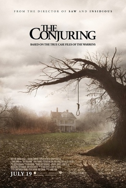
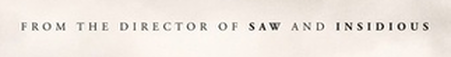
The very first line of text reads “FROM THE DIRECTOR OF SAW AND INSIDIOUS.” Rather than actually giving us the name of the director, the poster informs it’s audience that the director of The Conjuring is also the same person who directed two of the most well known horror movies of the modern era, Saw and Insidious. This rhetorical appeal actually works quite well, because almost every movie-goer has at least heard of these movies, and chances are that what they have heard is that they are two of the most thrilling and frightening movies to have hit the silver screen. In a way, this first line of text is subtly suggesting that if you enjoyed Saw and Insidious, then chances are you will also enjoy The Conjuring.
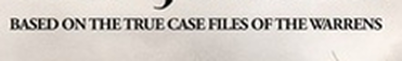
Perhaps the most chilling part of the poster is the text that lies just beneath the title, which reads, “BASED ON THE TRUE CASE FILES OF THEWARRENS.” The audience need not know who the Warrens even are to understand that this film is one that is based off of true events, or in this case, “case files.” In a way, this short line of text adds much in terms of credibility…and eeriness. The last bit of text that we see is on the lower left corner of the poster. This thin white lettering nicely contrasts against the darker background, although it is almost completely irrelevant to almost all movie-goes since it provides seemingly insignificant details about the cast, crew, and movie studio.
|
American Horror Story
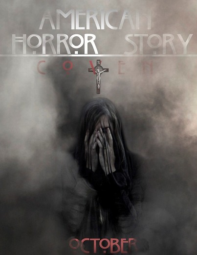
Outside the context of American Horror Story, these ominous letters would perhaps only give the reader a sense of elegance. But in American Horror Story, they seem to be a metaphor for the supernatural and uncanny. Unlike most horror genre titles American horror story is simplistic yet adds a sense of horror to the overly simplistic font which others may overlook
|
The overall design of the poster is effective in terms of mise-en-scene. The poster is simple and minimal yet powerful which allows the audience to focus on the main image of the poster which is the character. Although the character is covering her face the niche audience who have already watched the trailer for the American Horror story coven will know who the character is and what role she plays. The characters hands are visible revealing emaciated skin implying that this character may be demonic. Although the character is covering her face adds a element of mystery and fear as it does not reveal a substantial amount of the plot creating a sinister vibe. As audience we are just given an essence of what the backdrop is to this TV series. There is a substantial amount of horror conventions in this poster but this enables the audience to focus on the main image.
The poster itself is dark and gloomy which truly captures the essence of Horror by incorporating colours that install fear and terror within the audience. The colours used in the poster are subdued and dismal, connoting death and pain. The dark shadows enhance the duskiness and sorrow. The background consists of rising smoke that becomes lighter as it rises up to the title. These grey tones are highlighted through the thin red mist that is slightly seen in the top right hand corner of the poster. The red mist installs a sense of fear as it may be seen as a connotation of blood to the audience which may be used to foreshadow the violence and death that may be seen in the upcoming series. The woman is also seen in black attire which could be used to show to the audience that this character is dark and sinister which installs a sense of mystery as the character look unsafe in terms of appearance which makes the audience feel uneasy. Overall, this simplistic yet sinister poster is extremely successful in engaging the audience’s interest. 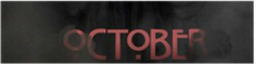
The most important part of this text is the release month 'October' which stands out with its larger and a deep red. It it is a vital piece of information; audience members will be filled with anticipation waiting for the series to begin.
|
Insidious
|
Insidious was made by the makers of Paranormal Activity and Saw. Referring to this on the poster draws an audience in as they already know it will be a good film as it is made by the people who have already produced two good selling films. The title of the film stands out clearly as it is mostly in a strong white color against a dark background. The style of the title is also unique as part of the title is red. The connotations of red are danger and blood. This suggests to the audience that the film has a dangerous dark side to it. The word Insidious means 'Intended to entrap' which gives a clue to what the film is about.
The main image on this poster is a sinister looking boy in front of an old big house. The big old house in the background is a typical convention of a horror film. The sinister looking boy goes against the average codes and conventions of a young boy as young boys are perceived as being ‘good’. This could relate to Claude’s theory of binary oppositions as the boy is opposite to normal boys. This could draw an audience to the film as the audience want to know why he’s different. The main image has a short depth of field as the boy is in focus and the house is out of focus. This gives a subtle hint to what the film is about. The main focus of the poster is the boy and not the house, which is unusual for a horror film as most of them take place in a big old house. This will draw in a bigger audience as they will believe it is different to other horror films they have seen. Most of the main images colours are all drained. This gives the film poster a dark and eerie feeling. The boy’s pyjamas are red which suggests danger towards the boy. Also, because the image is of the boy in his pyjamas, the audience may think, ‘why he is in his pyjamas, is there something wrong with him?’ this gets the audience thinking and encourages them to watch the film as they want to find out why. Having a dull main image makes the title of the film stand out. Also, inside the boys eye, the word insidious is written there. This could suggest to the audience that something supernatural is wrong with the boy. I think this will draw an audience as I find films with supernatural children is are scary as it is opposite to what they are perceived to be. 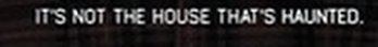
The tagline ‘It’s not the house that’s haunted’, is a quote from the film and the teaser trailer. This tagline encourages people to see the film as they want to know what haunted if the house isn’t.
|
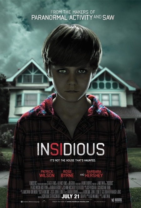
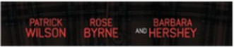
Having the actors and actressesnames on the film poster also attracts an audience. This attracts an audience because if someone is a big fan of Patrick Wilson, then they may decide to watch this film as he is one of the main actors in Insidious.
There is a billing block at the bottom of the poster. A billing block is a condensed block of writing that contains, companies, directors and othercast members and crew. This will attract the target audience as they may realise their favourite actor or director starred or directed the film. This will encourage them to watch the film as they are interested in their work. There are also the film institutions at the bottom of the poster. These are the company's logos that created Insidious. These help identify what genre the film is as most film companies stick to a certain genre, such as Blumhouse productions who produce horror films. |
